 The Clarinet BBoard
| New Topic | Go to Top | Go to Topic | Search | Help/Rules | Smileys/Notes | Log In | Previous Message | Next Message |
| Re: My other project - Buffet E11 refurb (PICS!) | |
|
| Reply To Message | Avail. Forums | Flat View | Newer Topic | Older Topic |
| Topics |
Author | Date | ||
|
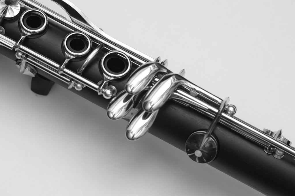
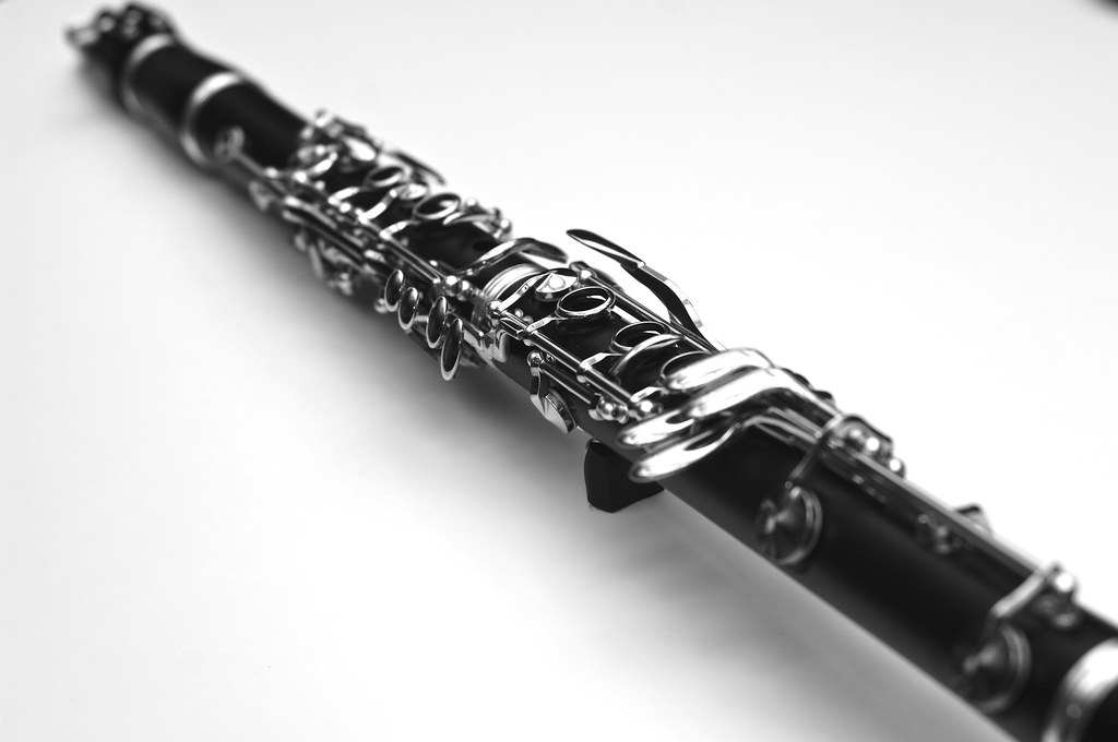
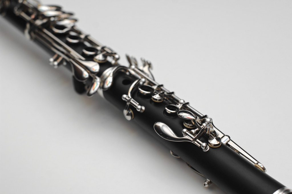
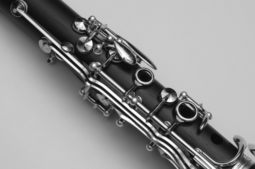
escher | 2013-11-13 16:17 | ||
|
escher | 2013-11-14 01:13 | ||
|
DavidBlumberg | 2013-11-14 02:25 | ||
|
clarnibass | 2013-11-14 05:57 | ||
|
escher | 2013-11-14 11:01 | ||
|
escher | 2013-11-14 12:21 | ||
|
clarnibass | 2013-11-15 07:18 | ||
|
Chris P | 2013-11-15 09:42 | ||
|
BobD | 2013-11-15 22:34 | ||
|
escher | 2013-11-15 23:01 | ||
|
escher | 2013-11-15 23:38 |

The Clarinet Pages
| For Sale Put your ads for items you'd like to sell here. Free! Please, no more than two at a time - ads removed after two weeks. |