 The Clarinet BBoard The Clarinet BBoard
|
Author: jcm499
Date: 2016-04-03 20:20
I strongly dislike Buffet’s new logo. I find it undistinguished and clumsy, and in my opinion it obliterates the 19th century grace and charm of the previous logo in favor of a heavy-handed mélange of the self-consciously new and the self-consciously antique. Well, in fairness, that last sentence was also undistinguished and clumsy, etc. I could go on (and on) about it, but I’d rather not rant about a (probably) trivial issue, over which I have no control, in a format that will be preserved on the internet in perpetuity (too late), so I’ll leave it here:
Is it ironic that Buffet’s new horn, hailed as the “Tradition,” is the first to abandon the logo the company has used since 1844?
I noticed that the upcoming Prodige student model clarinet seems to bear the new logo as well.
What do you think of the new logo? Will Buffet “update” its historic models like the R-13 with the new logo?
|
|
Reply To Message
|
|
Author: Paul Aviles
Date: 2016-04-03 21:34
I am an old fuddy duddy who doesn't like change.......at all. But I have to say that this doesn't really bother me that much. Maybe it's because I've been a Yamaha guy for 10 years or so and their logo has always looked like a perfunctory stamp. Or maybe it's because one of the more prestigious horns in Austria, the Gerold, has a logo that looks like something you'd find on a Junior Achievement project.
At any rate, if Buffet can remain distracted with concocting a logo, and that prevents them from screwing up the parts of their horns that work, I am all for it.
................Paul Aviles
|
|
Reply To Message
|
|
Author: jcm499
Date: 2016-04-04 01:07
Thank you, Silversorcerer. I’m always gratified when my constant, debilitating neuroticism at least provides amusement for someone.
New look, same great taste? Yeah, right. I can’t even.
I’ll concede the new logo is miles better than what the Noblet logo eventually became, but still. . . why?
Paul, I took a gander at that Gerold clarinet. $10,000 and a three-year wait? It’d feel like robbery if I took it for any less. It’s really weird about that junior achievement logo, though, especially since they go on about the visual aesthetics of the horn with its “flowing, rolling lines. . . homogenous, tapered shapes. . . drop-like keys melting into the keywork,” and of course, “proportions pleasing to the eye. . . based on the golden ratio.” The ellipses don’t represent my omissions, they’re in the copy!
|
|
Reply To Message
|
|
Author: Paul Aviles
Date: 2016-04-04 02:22
I know the Gerold pros and cons weren't the point, but there are some interesting design features incorporated into the architecture. One would be the "super glide" option. Gerold Angerer pebbles the surface of what keys you designate for this treatment with micro glass bead treatment. The idea is to get a "lotus leaf" effect so that your fingers never 'grab' as they slide across the surface. He also uses an interesting "one side" rod tightening configuration (one side of the rod has a head that can be placed as close or far from the key as you want - no swedging!).
Sorry
I'm a big fan.
...................Paul Aviles
|
|
Reply To Message
|
|
Author: seabreeze
Date: 2016-04-04 03:16
Who plays Gerolds? Anybody know of any recordings made on them? The mechanism certainly looks tight and sleek.
|
|
Reply To Message
|
|
Author: Paul Aviles
Date: 2016-04-04 04:37
On the Gerold website he has photos of current players some have been in the Vienna Philharmonic, one may still be a member. I had seen one appear in a Berlin Philharmonic performance. Those guys are always on the cutting edge of what is new and good. You may notice a number of Berlin clarinetists (if not all) using the Silverstein ligature.........just sayin'.
.................Paul Aviles
|
|
Reply To Message
|
|
Author: dubrosa22
Date: 2016-04-04 09:56
BC are crazy to change a logo so distinct (these days, not when it was initiated), so balanced visually and speaks volumes about its pedigree and quality craftsmenship.
Actually not crazy; pure nuts.
The new one looks like the sticker on a bag of nails at the hardware shop!
V
|
|
Reply To Message
|
|
Author: Clarineteer
Date: 2016-04-04 14:49
They would have been smarter to stay with the original logo but to deeply engrave it like they used to do on the golden era R13's so restoration would be easier.
|
|
Reply To Message
|
|
Author: seabreeze
Date: 2016-04-05 01:42
Gerolds do stand out, looking like today's clarinets. Under the search tag Gerold Klarinetten, Youtube has four or five Videos on the Gerold shop and just a hint, here and there, of how they sound.
The US does have a few small clarinet manufacturers worth considering. Guy Chadash, with his version of a vintage Buffet, Tom Ridenour, offering his fine affordable hard rubber (and sometimes wood) models, and Gao clarinets of Boston, which now offers three different "German bores," no less, and several other new models.
Have you checked out the Gaos?
see http://www.hkarlssonwoodwinds.com/Gao-Royal-Musical.html.
Post Edited (2016-04-05 18:55)
|
|
Reply To Message
|
|
Author: jcm499
Date: 2016-04-05 05:22
I also admire the small, artisanal clarinet makers (the “actual clarinet makers”)—the Gerold is stunning in its modernity, and with the Gao it’s refreshing to see a quality Chinese instrument proudly wearing a Chinese name instead of hiding behind a fake European one-- but I’m taken aback by the cynicism about the others!
Yes, the Buffet logo is the logo of a company, which is in turn a subsidiary of another company by the same name, with institutional investors; and yes, the last member of the Buffet family died without an heir many generations ago. (For what it’s worth, the much younger company Selmer Paris is still independent and operated by the descendants of Henri Selmer, as far as I can tell.)
But couldn’t the people who work for Buffet—the people who make the company what is is—be inspired by the history and heritage of the company, the first to manufacture the Bohem system clarinet and the poly-cylindrical bore? Isn’t it possible that talented craftsmen are attracted by the fame and prestige of the name? That musicians are inspired by the beautiful instruments, with their proud pedigree and craftsmanship and all the great Buffet-playing artists of the past, to greater heights of technique and expression? Denis Buffet-Auger is centuries dead, but the firm he created lives on to carry his skill and passion into centuries yet to come.
The logo represents that. A symbol, like life itself, has all the meaning we give it.
|
|
Reply To Message
|
|
Author: James S
Date: 2016-04-05 14:32
Hey Seabreeze
Gerold's instruments do have a number of cool, unique features. I am very fortunate to have some, though not much, correspondence with him. Unfortunately, I have not had an opportunity to visit his workshop.
Fun fact about the Gerold clarinet logo: it's a derivative of the 1972 Munich Olympics. The West German government hired a designer named Otto Aicher, who created a series of stick figures in various athletic poses representing different Olympic events. Shortly after the 1972 Olympics someone created a parodies for musical instruments and printed stickers. His logo is one of those stickers (and you can still find them attached to some old workshop equipment). Wolfgang Dietz, for example has one of those stickers on a tool case of his! I bet if you walked around the Wurlitzer workshop you would also find a sticker or two of that design from the 80s.
I have had the pleasure of playing on 6 or 7 different Gao models at TMEA. They are well-made instruments with a number of different bores and sound palates. My testing experience was about 3 hours over two days and during that time I had several great conversations with mr Gao. His instruments are built at his home near Boston (and at the convention he even shared some videos on his phone of him working on various components); he does not "finish" clarinets made elsewhere by anyone else. He did agree with me that his website needs some serious updating, but it's hard to fit web design into his schedule since he's a one man shop.
Anyhow...in regards to the topic at hand: I am disappointed but not terribly surprised. The old Buffet logo was truly iconic and recognizable, and this rush to "modernity" at the expense of tradition is a natural motion for companies purchased by venture capital, who care about creating value for shareholders (I.E. Growth) over all else. The new logo will be much easier to print on brass, if that matters.
I asked two Buffet USA reps whether they knew if the new logo would be printed on all future clarinets, not just the new Tradition and Protege models. Both of them admitted they didn't know, but shared they assumed the new emblem would slowly replace all instances of the old. I would wager we'll be seeing it on r13s within a year and a half
J
|
|
Reply To Message
|
|
Author: Paul Aviles
Date: 2016-04-05 14:54
An important point about the tuning of the German horns.
With my (circa 1984) Wurlitzer, I used the longest barrel and pulled out quite a bit and still did not suffer too badly with internal pitch issues. This is definitely not the case with the (far less expensive) modern Uebels. Pulled out to tune anywhere near where we tune, the horn is hopelessly out of tune with itself. If you request it, Wurlitzer will custom build an A=440 horn.
Gerold himself claims that the way he channels the tone holes (I know, this sounds a bit outlandish), you can achieve A=440 tuning at the barrel with no detriment to the internal pitch. Along with the other little advancements, it makes the horn very intriguing.
And while I am still on Gerold, I was led to believe that the Gerold logo is directly inspired by the Hopi Indian figure for fertility (that inspired the Olympic logo).
..............Paul Aviles
|
|
Reply To Message
|
|
Author: seabreeze
Date: 2016-04-05 18:19
JamesS,
Thanks for the correction on whether Gao makes the whole clarinet or just finishes clarinets made elsewhere. It's good to know that he produces (not finishes) them at his home in Boston. I have removed the misleading statement from my previous post to avoid confusion.
Information about Gao clarinets has been hard to get. At the 2014 International Clarinet Fest in Baton Rouge, Louisiana, I looked for Gao but I don't believe he had an exhibit. I plan to attend TMEA next year and hope to be able to try some of his instruments then. Did you have a favorite among them?
|
|
Reply To Message
|
|
Author: James S
Date: 2016-04-05 19:51
Attachment: image.jpeg (1470k)
Hey Seabreeze,
He didn't present at ICA in 2014. I hope he will be at TMEA (his distributor, Heather Karlsson, is based out of Texas). I'm sure if you email Gao or Heather they'll be able to provide a ton of information.
To be perfectly honest I have a hard time remembering all his models. The Legend (which is only produced in A) is designed to reflect a very traditional basset A clarinet. It totally sounds the part and would rock for Mozart or the Mendelssohn concert pieces. His student instrument (the G1) was free-blowing with a good scale. Naturally it's not as amazing as a pro horn, but it runs circles around many larger companies' student offerings. The G1 and the uebel Classic should be on all clarinet educators' go-to list for student and intermediate horns (respectively).
I played two other pro horns of his with names I don't remember. They both were very French, with an "idealized r13" quality to them. They had that coveted r13 flexability and that illusive "Buffet ring" but with stronger throat tones. I did not bring my tuner to dig inanely check the usual "problem notes," but the usual suspects sounded at least as good as most professional instruments I've played on.
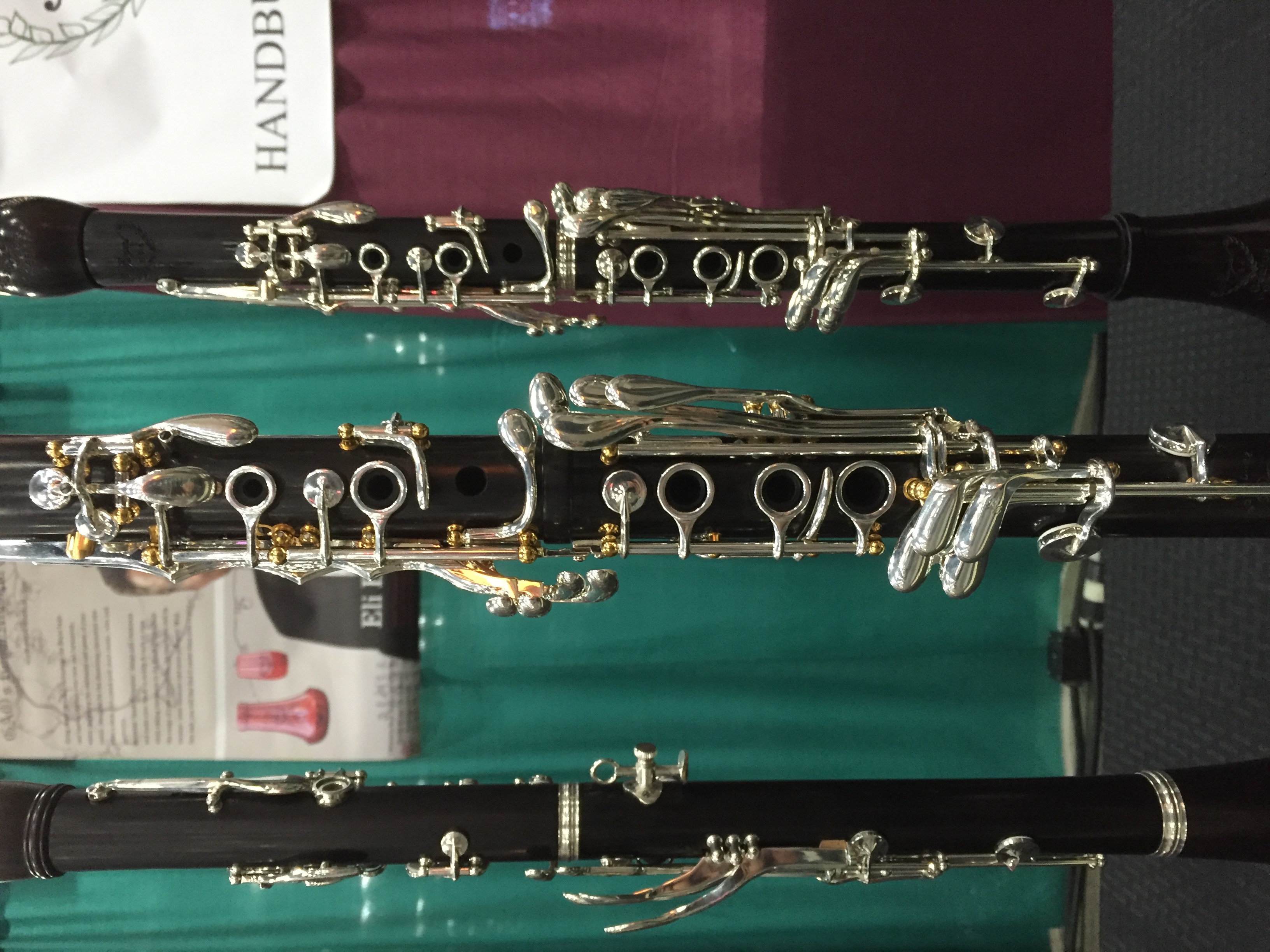
The Maze was probably my favorite model. It's a collaboration with RZ of the Czech Republic. Most (if not all) of the keys are RZ made (or at least stylized) and put on a Gao body/barrel/bell. The bore on this one is a bit tough to describe. It has a certain RZ "roundness" to the tone (which stuck out when I tried the RZ line at ICA 2014) combined with a certain German restraint. It's more controlled than his other models, but still has a bit of flexability to it. It does not have a French ringing quality, if that's your deal. It also has an adjusting screw on the throat Ab (see image) which I kept bumping into. Heather told me this guy is around the 5,000 buck mark, making it the most expensive Gao horn. It's built like a tank and offers something unique, at least to me.
J
|
|
Reply To Message
|
|
Author: seabreeze
Date: 2016-04-05 20:11
You have certainly whet my appetite for these clarinets with your description. After years of trying to sound "German" on various Boehm clarinets, I have concluded that I really love the "idealized r13" quality with its "coveted . . . flexibility and the 'Buffet ring'" even if only a few, well-set-up Buffets ever really play that way. (Buffet lovers are not crazy; they just tend to overgeneralize. The "Buffet Myth" has its origin in the rare specimen that actually lives up to this reputation). To get these qualities more reliably, along with "stronger throat tones," in some Gao models sounds pretty alluring. If the Maze model plays like an RZ, I will leave that choice to some other player who wants and can appreciate (and handle) that quality in a clarinet. Thanks for the info. It's a shame so many players have never tried or even heard of the Gaos. Maybe that will change soon.
Post Edited (2016-04-05 22:14)
|
|
Reply To Message
|
|
Author: Klose ★2017
Date: 2016-04-08 22:08
No one ever played Gerold in Vienna Philharmonic and Berlin Philharmonic, although they are great instruments.
----------------
On the Gerold website he has photos of current players some have been in the Vienna Philharmonic, one may still be a member. I had seen one appear in a Berlin Philharmonic performance. Those guys are always on the cutting edge of what is new and good. You may notice a number of Berlin clarinetists (if not all) using the Silverstein ligature.........just sayin'.
.................Paul Aviles
|
|
Reply To Message
|
|
The Clarinet Pages
|
 |
